What You Need to Know About Google Correlate
I get it. We say we like learning about tools, but very few of us mean it.
Either you’re just getting started in SEO and overwhelmed by the tsunami of web-based programs, Chrome extensions and local apps flooding your brain, or you’re a seasoned vet comfortably content with the tools that have earned their place in your routine.
But…
It’s free. And it may not be here forever. And your competitors probably aren’t using it. And you’ve already read this much. And FOMO.
Still with me? Let’s dive in. Here’s a comprehensive guide to Google Correlate.
- Targeting Customers Before They’re Ready
- Finding Your Seasonal Antithesis
- Understanding the Present & Predicting What’s Next
- Discovering Regional Distinctions
- Buying Low, Selling High
- Have Fun!
- The Inevitability of Dimensionality
- The Van Wilder of Betas
- The Problematic User Interface
- The Finicky Data
What Is Google Correlate?
Google Correlate uncovers keywords with similar time-based or regional search patterns to the data series or search query you provide.
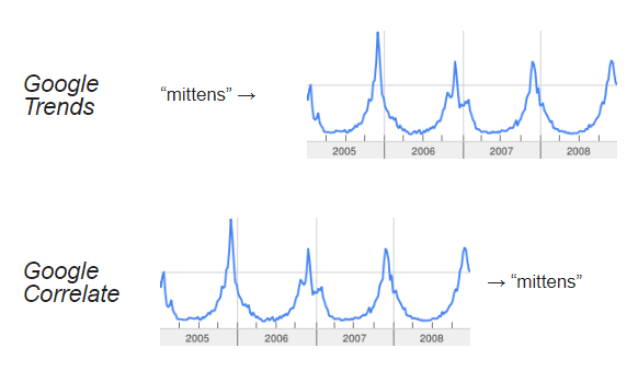
It’s been described as the Google Trends antonym, where instead of keywords producing patterns, patterns point to keywords.
Marketers, anthropologists, economists, and many others leverage Google Correlate to study and predict human behavior.
The History of Google Correlate
Knowing when and where influenza is spreading is critical. It helps us identify virus subtypes, learn when vaccines aren’t working, and when we ought to be more risk-averse to go out in public.
However, the CDC’s reporting was on a two-week delay, which can seem like an eternity when it comes to viruses.
Then came Google Flu Trends in 2008.
Researchers at Google hypothesized that using real-time, flu-related Google search activity would allow them to nowcast flu prevalence.
At first, it was incredibly accurate and received a lot of acclaim as a result.
It didn’t take long for folks at Google to realize this concept – correlating search trends with real-world data to build predictive models – could have unlimited uses beyond just the flu.
In 2011, Google Correlate was born.
How Google Correlate Works
I’ll keep this section brief because it’s admittedly over my head.
Google Correlate has trending data for all phrase-match search terms that exceed a certain threshold of search volume and endurance, and aren’t pornographic or misspelled.
It uses an Asymmetric Hashing algorithm and Approximate Nearest Neighbor (ANN) retrieval to strike a balance between speed and accuracy, because no one wants to wait 10 minutes for their results.
Finally, Google Correlate uses the Pearson correlation to compare normalized query data to surface the highest correlative terms.
If you’re more like Will from “Good Will Hunting”, you can read more about the retrieval and calculative methods here.
If you’re more like Charlie from “It’s Always Sunny in Philadelphia” (and me), read this instead.
How to Use Google Correlate
On the Google Correlate homepage, you’re faced with a few decisions.
Do you want a time-based or U.S. state-based correlation?
Are you typing in a query, uploading your own data or drawing a trend line freehand?
Let’s explore each of these routes.
Inputs
Keywords
 Using Google Correlate via a keyword search is incredibly easy.
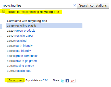
Type in a keyword, press “Search correlations” and you’ll immediately get a list of highly correlative terms according to these default settings: including your terms, weekly time series with no series shift, and United States (this may vary by IP).
The list includes 10 words sorted by correlation with 1.0 representing a perfect correlation and -1.0 a true negative correlation.
However, Google Correlate won’t show anything below a 0.6.
Select “Show more” at the bottom of the keyword list to see the next 10 most correlative terms.
You may continue doing this until 100 words are displayed, all of which can be exported into a CSV.
You can also choose to “Exclude terms containing [your phrase]” to get less redundant (but usually less correlative) results.
Spreadsheet
While using Google Correlate through keyword entries is simple, the spreadsheet method can be a little frustrating.
However, I’ve worked out the kinks to make it as painless as possible.
When setting up your spreadsheet, make sure it only has two columns and no header row. Any more than exactly what is required will trigger an error.
Next, save it in one of these formats: CSV (MS-DOS) or CSV UTF-8.
Each time you re-open those files, instead of just saving them, select Save-As and choose one of those CSV formats again.
When uploading a spreadsheet, select “Enter your own data” next to the search button. The window defaults to the Weekly Time Series tab, but you can switch to Monthly or U.S. States.
State-based
Finding correlations by states can be a great way to identify regional search patterns.
In the first column, list out the states with their full spelling. Not all states must be listed for this to work.
In the second column, list the values. The values can be anything you can imagine: sales, customers, leads, returns, tweets, etc.
You can also use 1’s and 0’s for absolute characteristics.
For instance, here are the highest correlative keywords with all coastal states assigned a value of one and the rest with zero.


Time-series
The time-series has two frequency options: weekly or monthly.
The first column is for the dates and the second column is for the values.
The date column must be in yyyy-mm-dd format, which requires you to format those cells as text since Excel will otherwise change it to mm/dd/yyyy.
Each time you re-open the spreadsheet, that column will automatically switch to the mm/dd/yyyy format.
I’m sure there’s a more permanent fix in the settings, but here is the best workaround I could find.
- Add a column between columns A and B, where column A has the dates, B is blank and C has the values.
- In cell B1, insert this formula =TEXT(A1, “yyyy-mm-dd”) and copy it down until it matches every populated row in column A. (Thanks for the tip, deadcode!)
- Copy column B, then Paste Special-Values back into B.
- Delete column A.
- Save-As CSV (MS-DOS) or CSV UTF-8
After selecting “Enter your own data” and the frequency you want, upload your file, choose the country in which the search data will originate, and name your time series.
While your searches by keyword are not saved, all uploaded files and drawings are, so give it a name that will make sense to you later.
For the monthly time series, the day of the month does not matter, and it doesn’t need to be consistent.
For instance, you could put these varying end-of-the-month values and it will work just fine:

The weekly time-series is a bit pickier. Each week must be represented by a Sunday.
Drawings
Using Google Correlate by drawing may be the least useful input, but it’s arguably the most fun.
Search by Drawing can be selected on the left side of the page. It uses the weekly time-series dataset with the y-axis measuring search activity, the x-axis representing 2004 to the most recent day, and the graph as your blank canvas.
Here I tried to draw the outline of a Donald Trump picture. Maybe it isn’t so useless with words around credit issues, shady foreclosure companies, casinos, and cute… well, maybe not.


Outputs
Time Series
For all time-series outputs, the default display is a line graph where your input and the highest correlative term are charted.
You can select another correlated keyword to have it graphed against your input instead.
There is an option to toggle between a line graph and scatter plot when viewing the data. Also, you can choose to view search activity from 50 countries.
The only real difference between the two frequencies, weekly and monthly, is the Search by Drawing inputs can only be graphed weekly.
| Input | Weekly Display | Monthly Display |
|---|---|---|
| Keyword | YES | YES |
| Spreadsheet | YES | YES |
| Drawing | YES | NO |
Before we jump to the U.S. map output, there are two less obvious features within the time-series display:
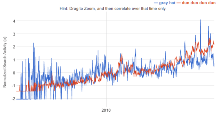
- Drag to Zoom: You can click-and-drag over a portion of the line graph to zoom in on a specific period. From there, you can “Click to search on this section only.” to find the highest correlations within just that time frame. This can be especially useful when you’re less interested about seasonal trends and more about specific happenings.

- Shift Series: On the left side of the page, you can shift the time series ahead or behind your input. Obviously, correlation doesn’t equal causation, and this doesn’t even mean the terms were searched by the same people. However, it can be interesting to string together queries and hypothesize around a typical search journey.

Let’s use the query “custom landscaping” as an example. With no time-series shift, the search patterns all make sense as nearly all relate to landscaping.
However, when we move the time-series three weeks before, the queries have nothing to do with landscaping at all, but it also doesn’t seem random either.

Nearly all of them are related to baseball and softball.
It’s fairly safe to say there’s a decent overlap between landscaping prospects and baseball equipment consumers.
If you were a landscaping company, how could knowing this influence your media targeting and content marketing strategy?
Since reading Ian Laurie’s article on Random Affinities nearly six years ago, I’ve been fascinated with the subject.
Using the Google Correlate Shift Series feature could be another way to uncover new random affinities to explore.
U.S. Map
The U.S. map output is much less dynamic, but it can still be useful.
Instead of a line graph, the default display is a map of the United States where darker shades indicate higher state-based correlations to your input.
Like the time-series display, this also has a scatter plot view as an option.
The scatter plot option is even more useful here because it appears to fix a glitch within the map display.
At first, only the input is graphed on the map. After toggling to the scatter plot and back, however, a new map of the highest correlative term (or whatever you select) appears just below.


In any output, the data can also be exported into a CSV for further analysis.
Google Correlate Use Cases
With many tools, learning what they can do and how to use them are relatively easy. It’s understanding when best to apply this knowledge that can get us stuck.
Below are possible use cases for Google Correlate.
By no means is this a comprehensive list, but hopefully it gives you some helpful thought starters on which to expand.
1. Targeting Customers Before They’re Ready

We can use tools like Google Trends, web analytics and sales data to know when to target customers just before they’re seasonally ready to engage with your brand.
However, Google Correlate can generate ideas on how to talk to them at that time (remember the baseball example?).
Additionally, some businesses experience seasonality in layers.
Take weight loss for example. There are the obvious New Year’s resolutions in January, but major life events that tend to happen during certain times of the year can also trigger the motivation to lose weight.
Planning a wedding, finding a new place to live and shopping for a car may spark the desire for a complete fresh start, which includes weight loss.
I’ll say it again; correlation does not equal causation. But when this kind of data leads to a hypothesis, it’s supported by other research, and it intuitively makes sense, isn’t it at least worth testing out?
2. Finding Your Seasonal Antithesis
Knowing when your audience is most likely to receive your message can help you market more efficiently.
Similarly, knowing when and how they’re least likely to listen can be equally helpful.
With Google Correlate, we can find the search terms that have the most opposed trendlines.
- Export the weekly or monthly trending for a search term in either Google Correlate or Google Trends.
- Multiply the values by negative one.
- Follow the same spreadsheet directions as described earlier in this article and you’re good to go.
Here is a list of the most negatively correlated search terms to “weight loss”:

While I’m still scratching my head when it comes to the environment and wildlife terms, the rest make sense.
When I’m lighting holiday candles and eating an entire tarte tartin by myself, don’t talk to me about my weight.
3. Understanding the Present & Predicting What’s Next
This is the aspect of Google Correlate where cultural anthropologists, economists and statistical-minded marketers have found most value.
It’s also the catalyst to Google Correlate’s existence (Google Flu Trends).
Conceptually, it’s simple: find a correlation, develop a hypothesis, build a model, validate it and refine it over time.
However, as we get more granular, the complexity grows.
I’ve managed to avoid learning Python, R and really anything else in the data science field up to now. So, I’ll just scratch the surface on a few themes and provide some further reading.
Find a Correlation
Google Correlate does all the work for you here, but keep a few things in mind.
- Make sure the dataset you leverage to create a predictive model is accurate and reliable. The shakier your input is, the more doomed your output will be.
- You’ll want to strike a balance between quality and quantity when choosing your correlative terms. By choosing only the highest correlative term to build your model, all your predictive eggs will be in one basket. At the same time, if you open the door to too many, less correlative terms, the data can get too normalized and inaccurate.
Develop a Hypothesis
Once you find a correlation, try to make sense of it by forming it into a hypothesis.
In his book, “Everybody Lies”, Seth Stephens-Davidowitz described his experience in using Google Correlate to try to help predict unemployment rate. After uploading monthly unemployment rates from 2004 to 2011, he found a pornographic site had the highest correlation.
His hypothesis? Folks who are unemployed are often alone, bored, and have a lot of time on their hands…
Build a Model
Here’s where my expertise leaves a lot to be desired, unfortunately.
I recommend reading the first part of Stephens-Davidowtiz and Hal Varian’s paper called A Hands-on Guide to Google Data. They cover how to clean up the data by removing spurious correlations and keywords likely to have a short shelf-life. Then they dive into regression techniques that specialize in time-series data with a sizeable number of predictors, like spike-and-slab regression.
Validate It
There are generally two ways to know if your model works:
- Wait and see.
- Leverage hold-out periods.
The second option has zero risk and is much faster.
Hold-out periods, also called out-of-sample tests, are when values are intentionally removed from your dataset for a certain amount of time. The purpose is to test your model by “holding out” the most recent historical data and seeing how closely it predicts what actually happened during that time.
This article from SAS Institute Inc. explains this concept in layman’s terms.
To upload hold-out periods in a Google Correlate, just delete the values (not the dates) in your spreadsheet.
Refine It over Time
Remember when I said Google Flu Trends was highly accurate at the start? Well, it didn’t last.
As you might imagine, with this space evolving so rapidly, few predictive models using search data can take a set-it-and-forget-it approach. That’s exactly what Google Flu Trends did.
News articles provided temporary spikes in search behavior. Google Suggest began influencing how people searched. People’s search patterns changed over time.
Each of these factors led to Google Flu Trends becoming increasingly inaccurate, with it missing the peak of the 2013 flu season by 140 percent.
For most of the media coverage, the story ended here.
However, some smart folks at the Warwick Business School concluded that the best approach was to use Google Flu Trends and the CDC’s delayed numbers to recalibrate each other for the most accurate estimates.
So, whether it’s simply refining the keyword list used for your model or finding ways to marry offline data with search behavior, you’ll want to periodically adjust the model for sustained accuracy.
4. Discovering Regional Distinctions
As I mentioned earlier, you can assign values to states based on any number of factors.
- Real-world numbers – e.g., purchases, revenue, customers, returns, share of voice
- Definitive characteristics – e.g., states without income tax, states with legalized marijuana
- Rankings – e.g., by cost of living, by population density
In 2016, 24/7 Wall St. published an article ranking states by gender inequality.
I used that ranking to create two Google Correlate spreadsheets.
The first one (ole boys club) had the fairest state with a value of 50 and the state with the most rampant inequality at one:

The second spreadsheet (glass sheiling) had the values reversed:

5. Buying Low, Selling High
Looking for an industry, topic or term on the rise so you can piggy back on its momentum? Or maybe you’d rather find something dropping quickly to jump in at a lower cost?
Either way, go to Search by Drawing and create the trend you’re seeking.

Make sure you read The Finicky Data section before getting too excited about this idea.
6. Have Fun!
Did you know:
- Nearly half of the highest state-based correlations to “mullet” include references Pensacola or Destin, Florida?
- The most regionally correlative term to “ridiculous” is “facebook posts”?
- “10 weeks pregnant” most closely correlates with “not funny”?
While spurious correlations can be a real issue when building models, they can often provide a good laugh at face value.
So, if you don’t feel like going down Wikipedia rabbit holes or binge-watching something on Netflix, get lost in Google Correlate for a few hours.
Oh, is that just me?
I was bored and found a few other funny Google Correlate examples for your entertainment.
Why Don’t We Use Google Correlate More Often?
The title of this article not so subtly suggests most of us rarely use this tool.
I’ll admit most of this assertion is anecdotal, but I do have some numbers to lean on as well.
- Search Volume: Moz Keyword Explorer estimates between 501-850 searches for Google Correlate occur each month. This pales in comparison to Google Trends, which has an estimated monthly search volume of at least 118,000.
- SEJ Coverage: How many Search Engine Journal articles are centered on Google Correlate until now? None (also true for Moz, Stone Temple and other SEO publications). How many even mention it? Three. To put it in perspective, Tom Cruise is mentioned in 10 articles. Yes, Tom Cruise.
- Show of Hands: In two recent digital marketing conferences, I asked the audience to raise their hand if they had used Google Correlate. Out of approximately 300 people, just one person said they had.
What’s keeping Google Correlate from being in our regular research rotation?
The Inevitability of Dimensionality
In the context of big data, high dimensionality refers to the challenges massive sample sizes with tons of variables can produce.
When faced with a substantial dataset, spurious correlations are bound to occur.
You know what has a substantial dataset? Google Correlate.
As I mentioned earlier, Google Flu Trends became increasingly inaccurate, and its high dimensionality was a big reason for it. Additionally, some tried to use the tool to forecast the stock market, which many claim is impossible to predict.
While this dimensionality has likely turned some away, I would argue in many cases it isn’t the tool or the data causing the issue; it’s the methodology or interpretation.
The Van Wilder of Betas
If you’ve followed Google over the years, you’ll know it’s not uncommon for its products to remain beta for a while.
Some of it is certainly semantics, but it has rubbed more than a few people the wrong way.
Google Correlate has been in beta for seven years.
The question is whether this is just semantics (like with Gmail), or if it’s truly still in early stages of development.
The Problematic User Interface
I’ve covered the UI issues in the How to Use Google Correlate section, so I won’t belabor the point here.
As you can see in Google’s suggestions, I’m not the only one who has experienced difficulties.

Between this and the shaky data (more on that in a second), Google Correlate can sometimes seem like more trouble than it’s worth.
The Finicky Data
A problematic UI is one thing, but limited data is another.
Here are three ways Google Correlate’s data leaves more to be desired:
- In 2011, several countries were added to Google Correlate. As a result, the U.S. sample size was reduced to the same level of countries that were added. This meant larger variances for lower-volume queries, as well as the elimination of some low volume queries altogether.
- Although the FAQ page claims the data begins in January of 2003, none of the graphs start until January 2004.
- Frustratingly, Google Correlate stopped updating on March 12, 2017. There was no announcement from Google that I’m aware of. I’ve reached out to folks at Google via Twitter, submitted feedback and have even emailed some of the original creators of the tool. No response yet.
This third data issue towers over the other two. The longer we go without fresh data, the less valuable Google Correlate is. Eventually, it’ll be a deal breaker, rendering the tool useless. If you’re so inclined, please submit your own feedback and request for Google Correlate to resume reporting on fresh data. If enough of us ask, perhaps it will rise on the priority list, or at least get an answer.
So Now What?
At this point you may be inspired to give this tool a(nother) go, or you could just as likely be deflated by its drawbacks.
If I’m being honest, I’ve ping-ponged to each extreme while writing this.
Google Correlate can be polarizing for some, but if you’re a search marketer, it’s worth it to have first-hand experience to decide for yourself.
Oh, and don’t forget to bug Google about turning the fresh data back on!
Further Reading:
- Google Correlate Tutorial
- Google Correlate: Exploring Big “Google Search” Data
- In One America, Guns and Diet. In the Other, Cameras and ‘Zoolander’
- Google Correlate: How to Use It for Marketing, SEO & Content
- Google Correlations Review
Image Credits
Google Trends vs. Google Correlate: Google Correlate
Donald Trump: naukrinama.com
All other images, screenshots, and video taken by author, July-August 2018
Donald Trump: naukrinama.com
All other images, screenshots, and video taken by author, July-August 2018
Source of this amazing post you can read it in : https://www.searchenginejournal.com/google-correlate-research-tool/266341/?ver=266341X3